 PDF Form Field Properties
All form fields have properties that can be used to edit the style and behavior of the form field. The properties available to form fields depend on the type of form field. If you want to view/edit the properties of a form field, then click Select Fields in the Form tab, right-click the field and click Properties:
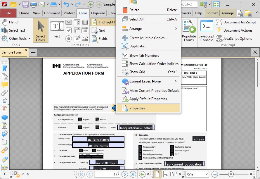
Figure 1. Right-Click Shortcut Menu for Forms, Properties Highlighted
The Properties pane for the field will open:
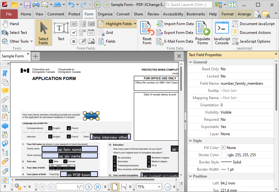
Figure 2. Text Field Properties Pane
Property Definitions
Please note that most properties are shared by all form fields, but some properties are unique to specific types of form field. The list below details the properties that all form fields share:
•General Properties:
•Read Only determines whether or not the field can be edited.
•Locked determines whether or not the field can be moved, and whether or not its properties can be modified.
•Field Name determines the name of the field. This name is present when the Select Fields tool is enabled, and when fields are listed in the Fields pane.
•Tooltip determines the information displayed when the pointer is hovered over the field.
•Mapping Name determines the mapping name that the field uses. This name is used to reference interactive form data when the form is exported, and does so without affecting the appearance of the name in the original document.
•OC Details determines the optional content layer to which the field belongs. When a field belongs to an optional content layer, it displays only when the layer is enabled. Use the Layers pane to view/create/edit layers, as detailed here.
•Style Properties:
•Fill Color determines the fill color of the field.
•Stroke Color determines the border color of the field.
•Width determines the width of the field border.
•Border determines the style of the field border.
•Position Properties:
•Left determines the distance of the field from the left margin.
•Top determines the distance of the field from the bottom margin.
•Width/Height determine the width/height of the field.
•Actions Properties:
•Mouse Down initiates an action when the left mouse button is pressed (without being released) on the field.
•Mouse Up initiates an action when the left mouse button is clicked (pressed and released) on the field.
•Mouse Enter initiates an action when the pointer moves into the field.
•Mouse Leave initiates an action when the pointer moves out of the field.
•On Focus initiates an action when the field is selected.
•On Blur initiates an action when the field is deselected.
•Click the ellipsis icon on the right of actions to add/edit field actions:
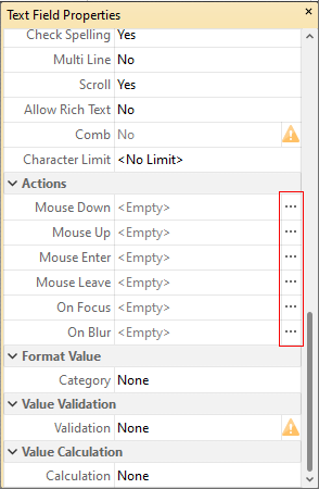
Figure 3. Text Field Properties Pane, Action Ellipses
The process of adding actions is detailed here.
The list below details additional properties that many form fields share:
•The Default Text Format Properties determine the default properties of text entered into fields:
•Font determines the font used.
•Font Size determines the size of the font.
•Text Color determines the color of the font or, in the case of radio buttons and check boxes, the color of the tick used when the form is selected.
•Orientation determines the orientation of text entered in the field. This property is present in all form fields except barcodes.
•Visibility determines the visibility of the field. This property is present in all form fields except barcodes.
•Required determines whether or not the field is a required field. Required fields must be filled before documents that contain them can be submitted. This property is present in all form fields except radio buttons, barcodes and image fields.
•Exportable determines whether or not the field data can be exported from the form. This property is present in all form fields except radio buttons, barcodes and image fields.
•The Format Value properties determine the type of information permitted to be entered in the field and the format in which it should be entered:
•Category determines the category of the field:
•Number sets the field input to numerical values. The following options are available for this property:
•Decimal Places determines the number of decimal places displayed.
•Separator Style determines the separators used for numbers.
•Currency Symbol determines the currency symbol used in the field.
•Symbol Location determines the location of the currency symbol in relation to the number.
•Add Space inserts a space between the currency symbol and the number.
•Negative Number Style determines how numbers with negative values are displayed.
•Percentage sets the field input to percentage values. The following options are available for this property:
•Decimal Places determines the number of decimal places used.
•Separator Style determines the separator used for numbers.
•Date sets the field input to date values and adds a dropdown calendar to the field. Use the Date Format parameter to determine the format of dates.
•Time sets the field input to time values (hours and minutes). Use the Time Format parameters to determine the format of time values.
•Special sets the field input values to a special format. Use the Special Format parameter to determine the format:
•ZIP Code
•ZIP Code +4, which is used for nine-digit postal codes.
•Phone Number
•Social Security Number
•Custom Action adds custom JavaScript actions to fields:
•Format Action is used to enable custom JavaScript for formats. Click the ellipsis icon to add/view JavaScript.
•Keystroke Action is used to enable custom JavaScript for keystrokes. Click the ellipsis icon to add/view JavaScript.
•If the options above are used then the Edit Action: "Run a JavaScript" dialog box will open. Enter the desired JavaScript for the action and then click OK:
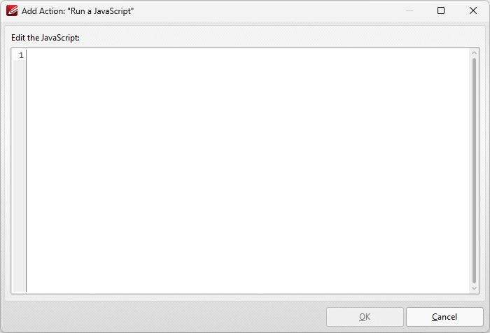
Figure 4. Edit Action: "Run a JavaScript" Dialog Box
•The Value Validation properties determine the validation of values entered into the field. These properties can be used to ensure that the information entered into fields fits within specific parameters:
•Validation determines how values are validated:
•Value in Range sets the range within which values entered into the field must fall:
•From specifies the minimum value.
•To specifies the maximum value.
•Custom Action enables the use of custom JavaScript in order to validate values entered in the field:
•Validation Action specifies the JavaScript to use, as detailed in (figure 4).
The Value Calculation properties determine the value of fields using other fields, and are used in forms where entered form data creates the value of further forms, such as when several orders are placed that combine to give a total price. The available properties are detailed below:
•None specifies that calculations are not performed.
•Sum uses the sum of specified fields.
•Product uses the product of specified fields.
•Average uses the average of specified fields.
•Minimum uses the minimum value of all specified fields.
•Maximum uses the maximum value of all specified fields.
•Please note that when the Sum, Product, Average, Minimum and Maximum properties are used, the additional entry "Fields" will appear beneath the Calculation property. Use this entry to specify the fields used in these calculations.
•Simplified Notation enables the insertion of a custom calculation to be performed on fields. Use the Simple Notation box to determine the calculation. Use the document field names and standard mathematical notation to enter custom calculations.
•Custom Action enables the use of custom JavaScript in order to perform calculations and determine the order in which calculations are performed. Click the ellipsis icon to add custom JavaScript, as detailed in (figure 4).
Options Properties
The Options Properties are different for all form fields:
Text/Date Fields
The Options Properties for text/date fields are detailed below:
•Alignment determines the text alignment within the text/date field.
•Default Value determines the default value of the text/date field. Text/date fields will show this value by default. If they are edited and then reset then the value entered for this property will be displayed.
•File Select determines whether or not files on the local computer are selected when their filename is entered in the text/date field. If set to Yes then the file contents are submitted as the value of the text/date field when the form is submitted.
•Password determines whether or not the text/date field is a password field. If text/date fields are designated as passwords then text entered into them will be encrypted in the standard manner:
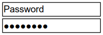
Figure 5. Standard Text Field (above) and Standard Text Field with Password Enabled (below)
•Check Spelling determines whether or not the spelling of words entered in the text/date field is automatically checked.
•Multi Line determines whether or not multiple lines of text are permitted in the text/date field.
•Scroll determines whether or not a scroll bar is added when multiple lines of text are entered into text/date fields.
•Allow Rich Text determines whether or not the text/date field permits rich text such as bold and italics.
•Comb determines whether or not line separators are inserted between characters in the text/date field:
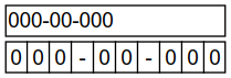
Figure 6. Standard Text Field (above) and Standard Text Field with Comb Enabled (below)
•Character Limit determines the maximum number of characters permitted in the text/date field.
Button/Image Fields
The Options Properties for button/image fields are detailed below:
•Layout determines the layout of the button/image field, which can be displayed as text label, icon or a combination of both elements:
•Label Only is the default setting. The text label that the Up Label property specifies is the only element displayed on the button/image field. The Up Label property becomes available in the Options properties when the Label Only setting is enabled.
•Icon Only uses the custom image that the Up Icon property specifies to represent the button/image field. The Up Label property becomes available in the Options properties when Icon Only setting is enabled.
•Icon Top, Label Bottom displays a custom image as the upper section of the button/image field and the text label beneath the image.
•Label Top, Icon Bottom displays the text label as the upper section of the button/image field and a custom image beneath the text.
•Icon Left, Label Right displays a custom image on the left and the text label on the right.
•Label Left, Icon Right displays the text label on the left and a custom image on the right.
•Label over Icon uses a custom image to represent the button/image field and places the text label over the image.

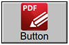
Figure 7. Available Layout Options for Button/Image Fields
•Behaviour specifies the visual effect when button fields are pressed. (Note that this property is inactive for image fields despite being detailed in the Properties pane). The following options are available:
•None specifies that no visual change occurs.
•Invert inverts the fill color of the button/image field.
•Outline creates an outline around the button/image field.
•Push creates a visual effect when buttons/image fields are clicked:
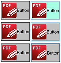
Figure 8. Default to Invert (Top), Default to Outline (Centre) and Default to Push (Bottom)
•Up Label specifies the text that the button/image field uses. N.b. A Layout property that specifies a label must be enabled for the option to be available.
•Up Icon specifies the icon that the button/image field uses. N.b. A Layout property that specifies an icon must be enabled for the option to be available.
The Icon Placement properties are also available for button/image fields. These properties are available when an icon is specified in the Layout property, and they determine settings for the icon used in the button/image field:
•When to Scale determines when icons are scaled to the size of the button/image field on which they are featured:
•Always scales the icon to the size of the button/image field in all cases.
•Scale Type determines how the icon is scaled:
•Proportionally retains the aspect ratio of the icon
•Non-proportionally ignores the aspect ratio of the icon.
•Never retains the original size of the icon regardless of the size of the button/image field.
•Icon is Too Big scales icons in cases where icons are larger than the button/image field.
•Icon is Too Small scales icons in cases where icons are smaller than the button/image field.
•Fit to Bounds fits the icon to the bounds of the button/image field.
•Horizontal Position determines the horizontal position of the icon in the button/image field.
•Vertical Position determines the vertical position of the icon in the button/image field.
Barcode Fields
The Options Properties for barcode fields are detailed below:
•Symbology determines the format of the barcode, as detailed in (figure 1):
•PDF417 is a stacked linear barcode used primarily in transport, identification cards and inventory management.
•QR Code is a matrix barcode that features advanced storage capacity in comparison to older barcodes, and is one of the most common barcodes used worldwide.
•Data Matrix is similar to a QR Code barcode. Data Matrices hold less information that QR Codes, but they are more secure.
Additional Option Properties are available, depending on the selected barcode format:
•Compress Data converts the content of barcodes into a .zip archive when it is enabled. Please note that this is not recommended for mobile scanners, as they are usually incompatible with .zip files.
•X Dimension determines the size of the barcode.
•ECC Level (Error Correction Capability) determines the level of compensation when barcodes are damaged, for example when printing imperfections occur. A higher ECC level results in a higher degree of data retention in the event of damage, but also requires more space. Please note that this property is not available for the Data Matrix barcode format.
•Y/X Ratio sets the ratio of the barcode axes when the PDF417 barcode format is used.
Check Box Fields
The Options Properties for check box fields are detailed below:
•Check Box Style determines the icon used when check boxes are selected.
•Export Value determines the value that represents check boxes when they are exported.
•Checked by Default determines whether or not the check box is checked by default.
Dropdown Fields
The Options Properties for dropdown fields are detailed below:
•Combo Box Items determine the options in the dropdown menu. See below for an example on how to add/edit options in the dropdown menu.
•Sort Items arranges the listed items numerically and/or alphabetically. Note that numerical sorts are performed before alphabetical sorts in cases where both sorts apply.
•Allow Edit enables a text box at the top of dropdown menus that can be used to enter custom values as the value of the dropdown menu:
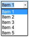
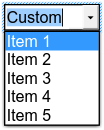
Figure 9. Standard Dropdown (left) and Allow Edit Dropdown (right)
Please note that this property can also be used to give dropdown menus a title that is different from the entries that it contains. An example of this process is detailed here.
•Check Spelling is available only when the Allow Edit property is enabled, and auto-checks the spelling of custom values entered into dropdown menus.
•Immediately Commit saves selected values as soon as they are selected. If this option is not enabled then the value is saved only when the user tabs out of the current field/clicks a different form field.
Radio Button Fields
The Options Properties for radio button fields are detailed below:
•Radio Button Style determines the icon used when radio buttons are selected.
•Button Choice is a unique identifier for the radio button and differentiates it from other radio buttons that have the same name.
•In Unison enables single-click selection for all radio buttons that share the same name and content as the selected radio button.
•Checked by Default determines whether or not the radio button is checked by default.
List Box Fields
The Options Properties for list box fields are detailed below:
•List Box Items determine the options in the list box. See below for an example on how to add/edit options in the list box.
•Sort Items arranges the listed items numerically and/or alphabetically. Note that numerical sorts are performed before alphabetical sorts in cases where both sorts apply.
•Multiple Selection enables the selection of multiple list box entries.
•Immediately Commit saves selected values as soon as they are selected. If this option is not enabled then the value is saved only when the user tabs out of the current field/clicks a different form field. Please note that this option is not available when the Multiple Selection property is enabled.
The Selection Change property is also available for list boxes. This property initiates a JavaScript action when the selection in the list box is changed. Click the ellipsis icon to add custom JavaScript. The Edit Action: "Run a JavaScript" dialog box will open. Enter the desired JavaScript for the action and then click OK, as detailed in (figure 4).
Digital Signature Fields
There are no Options Properties available for digital signature fields. However, it should be noted that the When Signed property is available for this format of form field. The When Signed property determines the action taken when signature fields are signed:
•Do Nothing determines that no action is taken.
•Mark as Read-Only classifies specified fields as read-only in order to disable subsequent editing. This option is explained in more detail below.
•Custom Action enables the activation of custom JavaScript when signature fields are signed. When this option is selected the Action property will appear. Click the ellipsis icon on the right of the property to add JavaScript:
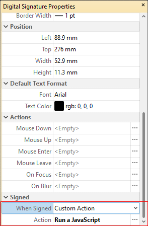
Figure 7. Digital Signature Properties Pane, Action Property
The Edit Action: "Run a JavaScript" dialog box will open. Enter the desired JavaScript for the action and then click OK:
Figure 8. Edit Action: "Run a JavaScript" Dialog Box
•Mark as Read-Only classifies specified fields as read-only in order to disable subsequent editing. When this option is selected, the Fields Range property will appear beneath the When Signed property:
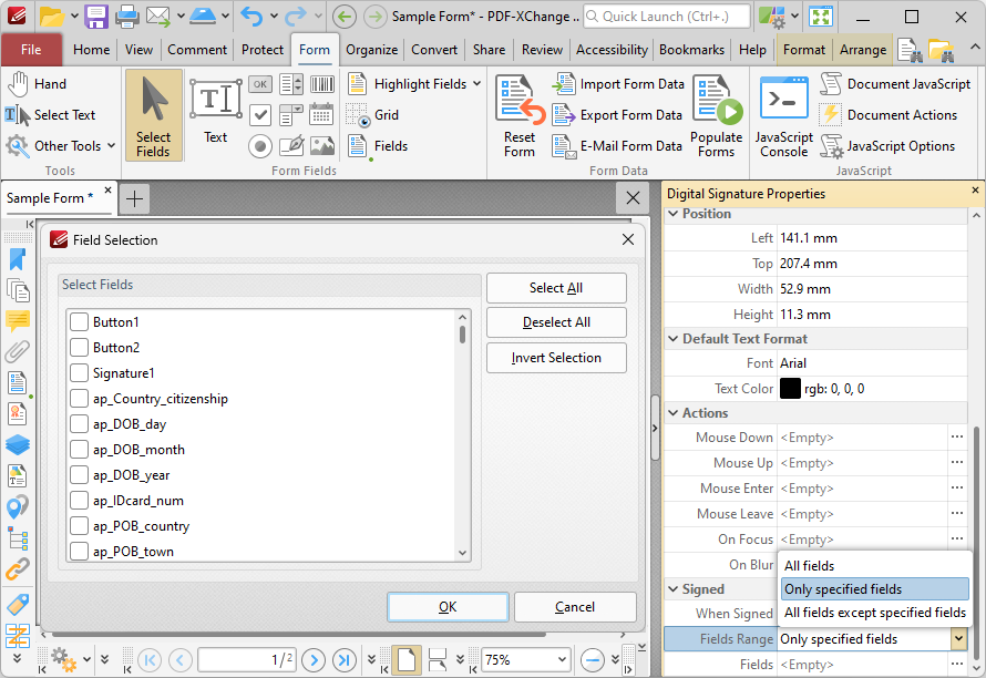
Figure 9. Mark as Read-Only Options
•Select All fields to set all fields in the document as read-only.
•Select Just specified Fields to specify the fields that are set as read-only.
•Select All fields except specified to specify the fields that are not set as read-only.
The Fields property will become available when an option to specify fields is selected. Click the ellipsis icon on the right of the property to specify fields. The Field Selection dialog box detailed in (figure 9) will open. Select the desired fields and then click OK.
Adding and Editing Dropdown Menu Items
Follow the steps below to add/edit dropdown menu items:
1. Click Select Fields in the Form tab and select the dropdown menu, then right-click it and click Properties. The Dropdown Properties pane will open:
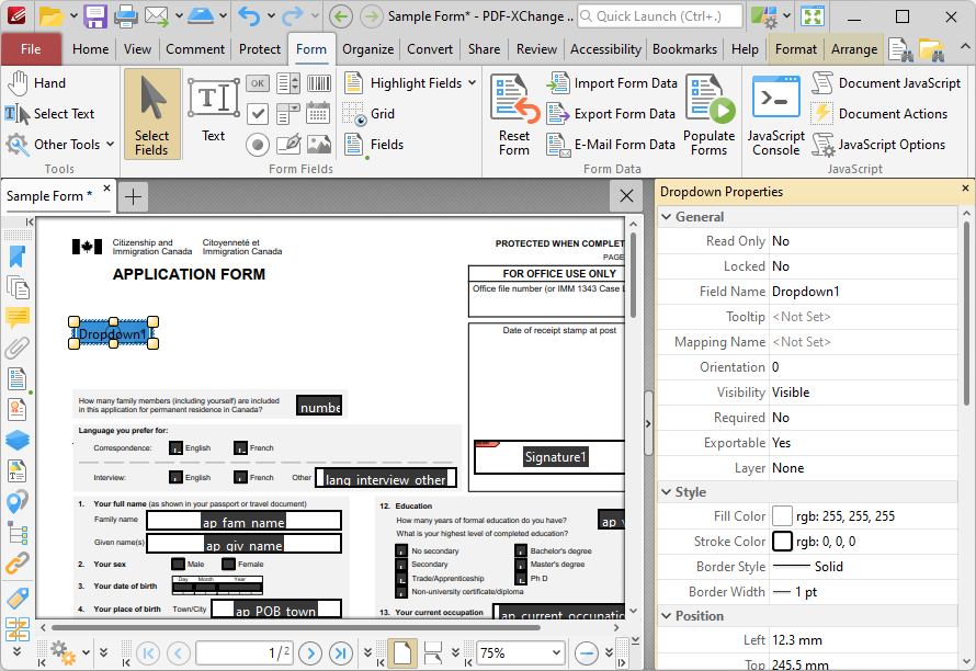
Figure 10. Selected Dropdown Menu
2. Move to the Combo Box Items property and click <Empty>:
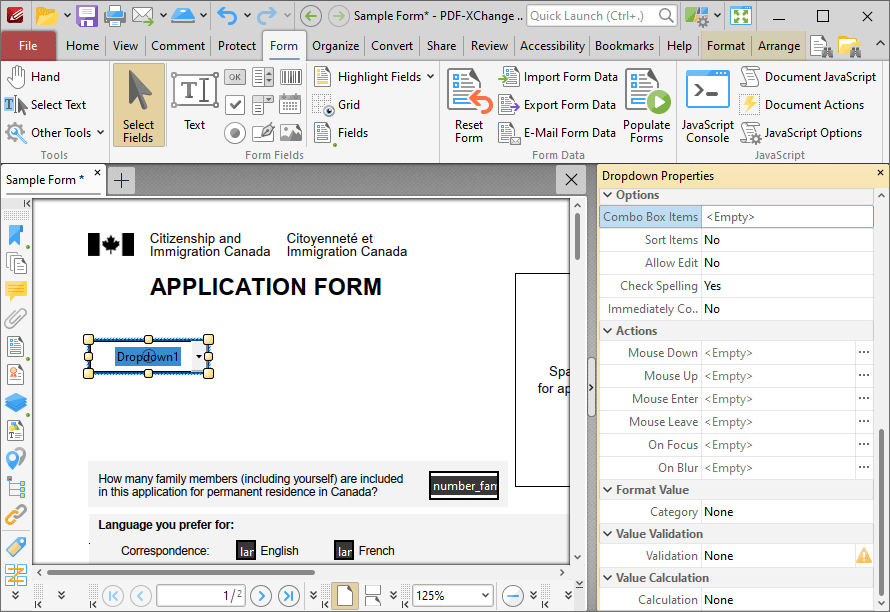
Figure 11. Dropdown Properties Pane, Combo Box Items
The Dropdown Menu Items pane will open. This pane is used to add/edit dropdown menu items:
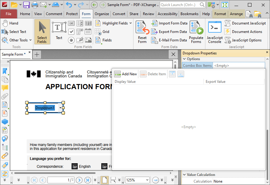
Figure 12. Dropdown Menu Items Pane
3. Click Add New to add new entries to the dropdown menu:
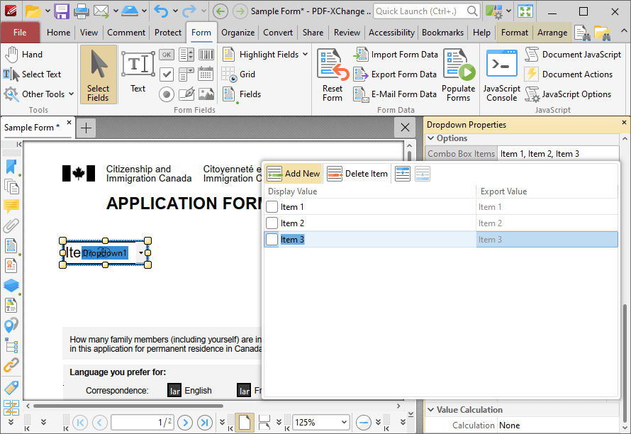
Figure 13. Dropdown Menu Items Pane
•Click Delete Item to delete the selected item from the dropdown menu.
•Click the Up and Down buttons to move selected items up or down in the list. The order of items in the pane represents the order to items in the dropdown menu.
•Enter values in the Export Value column to determine the value given for exported dropdown menu items. Note that values must be first selected in the Dropdown Menu Items pane and then clicked in order to edit the name.
•Click to select Display Value names, and then click them again in order to edit the name.
•Select the check box of the item to be used as the default selection in the dropdown menu. This item will be selected when the dropdown menu is in its default state.
•Click and drag the yellow control points to resize the dropdown menu as desired.
4. Click outside the Dropdown Menu Items pane to complete the process, then enable the Hand Tool to select dropdown menu items:
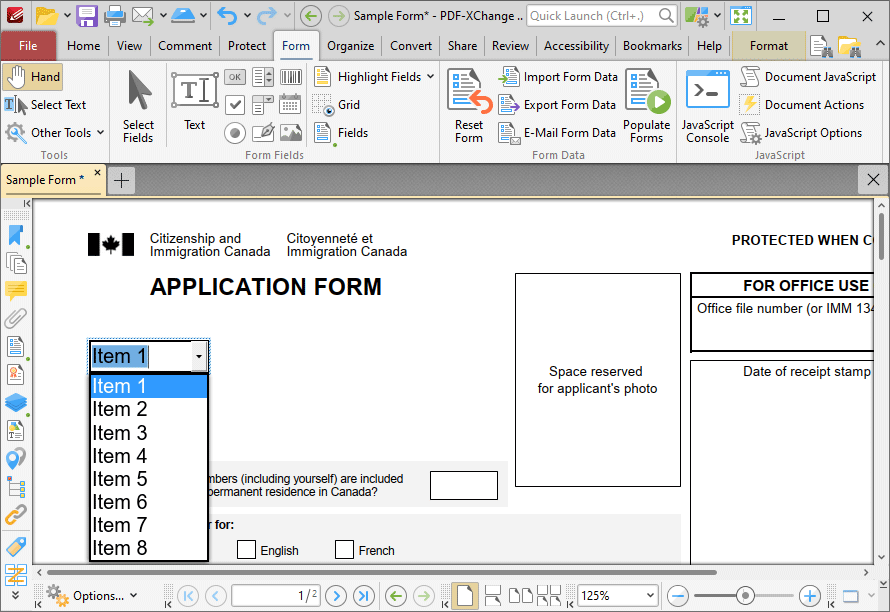
Figure 14. Completed Dropdown Menu
Adding and Editing List Box Items
Follow the steps below to add/edit list box items:
1. Click Select Fields in the Form tab and select the list box, then right-click it and click Properties.
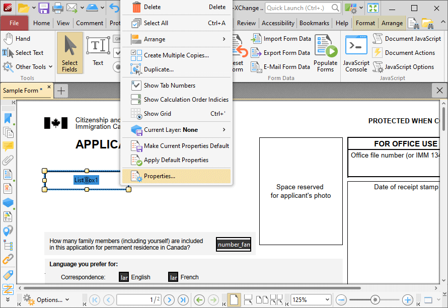
Figure 15. Selected List Box
The List Box Properties pane will open.
2. Scroll down to the List Box Items property and click <Empty>:
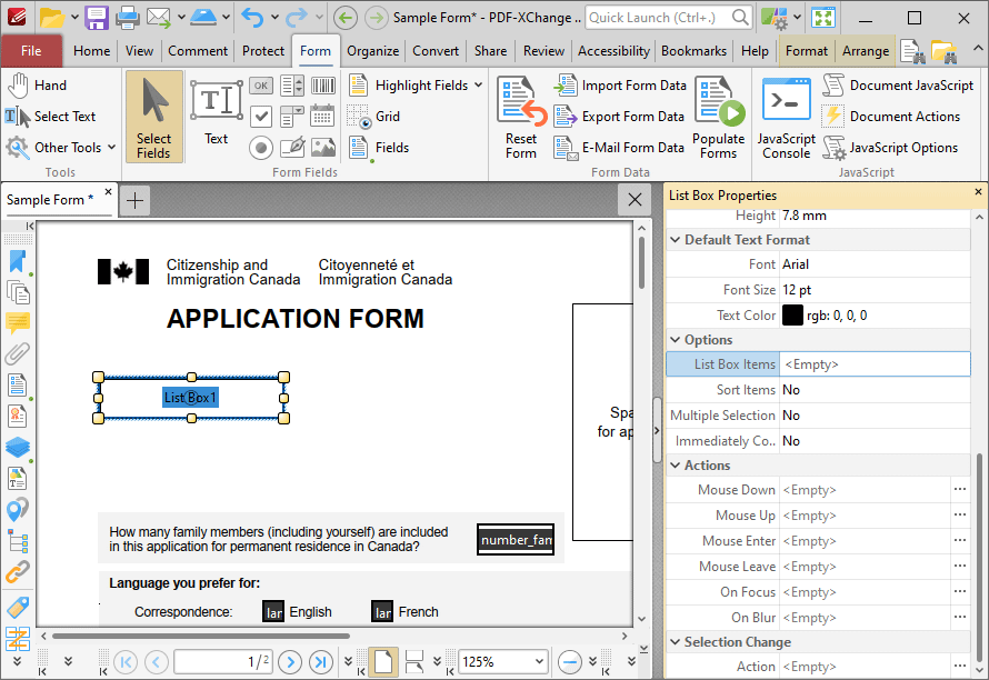
Figure 16. List Box Properties Pane, List Box Items Property
The List Box pane will open. This pane is used to add/edit list box items.
3. Click Add New to add new entries to the list box:
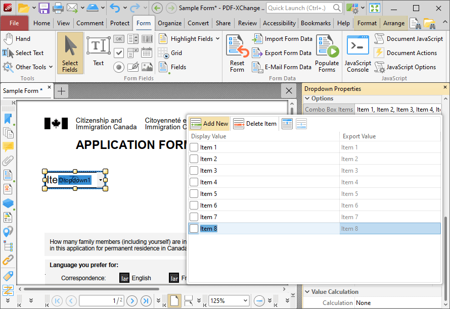
Figure 17. List Box Pane
•Click Delete Item to delete the selected item from the list box.
•Click the Up and Down buttons to move selected items up or down in the list. The order of items in the pane represents the order to items in the list box.
•Enter values in the Export Value column to determine the value given for exported list box items. Note that values must be first selected in the List Box Items pane and then clicked in order to edit the name.
•Click to select Display Value names, and then click them again in order to edit the name.
•Select the check box of the item to be used as the default selection in the list box. This item will be selected when the list box is in its default state.
•Click and drag the yellow control points to resize the list box as desired.
4. Click outside the List Box Items pane to complete the process, then use the Hand Tool to select list box items:

Figure 18. Completed List Box